hermaid - Redesign For Companies Web Page | Dec 2024
Partly Launched, B2B, Healthcare
Partly Launched, B2B, Healthcare

Timeline
2 weeks
Industry
Healthcare,
Female Health
Role
UX/UI Designer
Led the end-to-end UX redesign process, aligning with CPO and CTO on strategic goals, defining the high-level framework, and iterating based on peer design reviews
Task
Define the Problem
Secondary Research
Competitive Analysis
Storytelling
Wireframing
Visual Design
Hermaid aims to provide holistic female healthcare solutions, starting with menopause. Our previous website lacked clarity about our offerings, the value we provide, and why our work matters to our target audience—leading to confusion and disengagement.
To address this, my team and I redesigned the corporation page to clearly communicate our value to companies and HR managers, improving readability and engagement.
Problem
Overwhelming information, low understandability.


1. Confusing Content
2. Visual Inconsistency
3. Low Conversion Rate
Goals
1. Imrpove the content and storytelling.
2. Optimise visual consistency.
3. Increase user engagement.
Research
I conducted 5 user interviews to find out how is the experience when people visiting our website.
I focused on some key questions include:
1. Is it easy to find what you are looking for on the website?
2. How would you rate the quality of the content on our website?
3. Does the website provide enough information about our services?
4. Does the website design enhance or hinder your experience?
5. If you could change one thing about the website, what would it be?
6. How would you rate the overall experience with our website?
Competitor Analysis
I reserched 5 competitors, I took away 3 good patterns I can learn from:
1. Value-oriented: Elaborating the values of the offers/services clearly
2. Provide with number-driven benefits which is much more convincing 3. Provide free resources like articles can enhance engagement
I reserched 5 competitors, I took away 3 good patterns I can learn from:
1. Value-oriented: Elaborating the values of the offers/services clearly
2. Provide with number-driven benefits which is much more convincing 3. Provide free resources like articles can enhance engagement

Content Audits of current website

Ideation
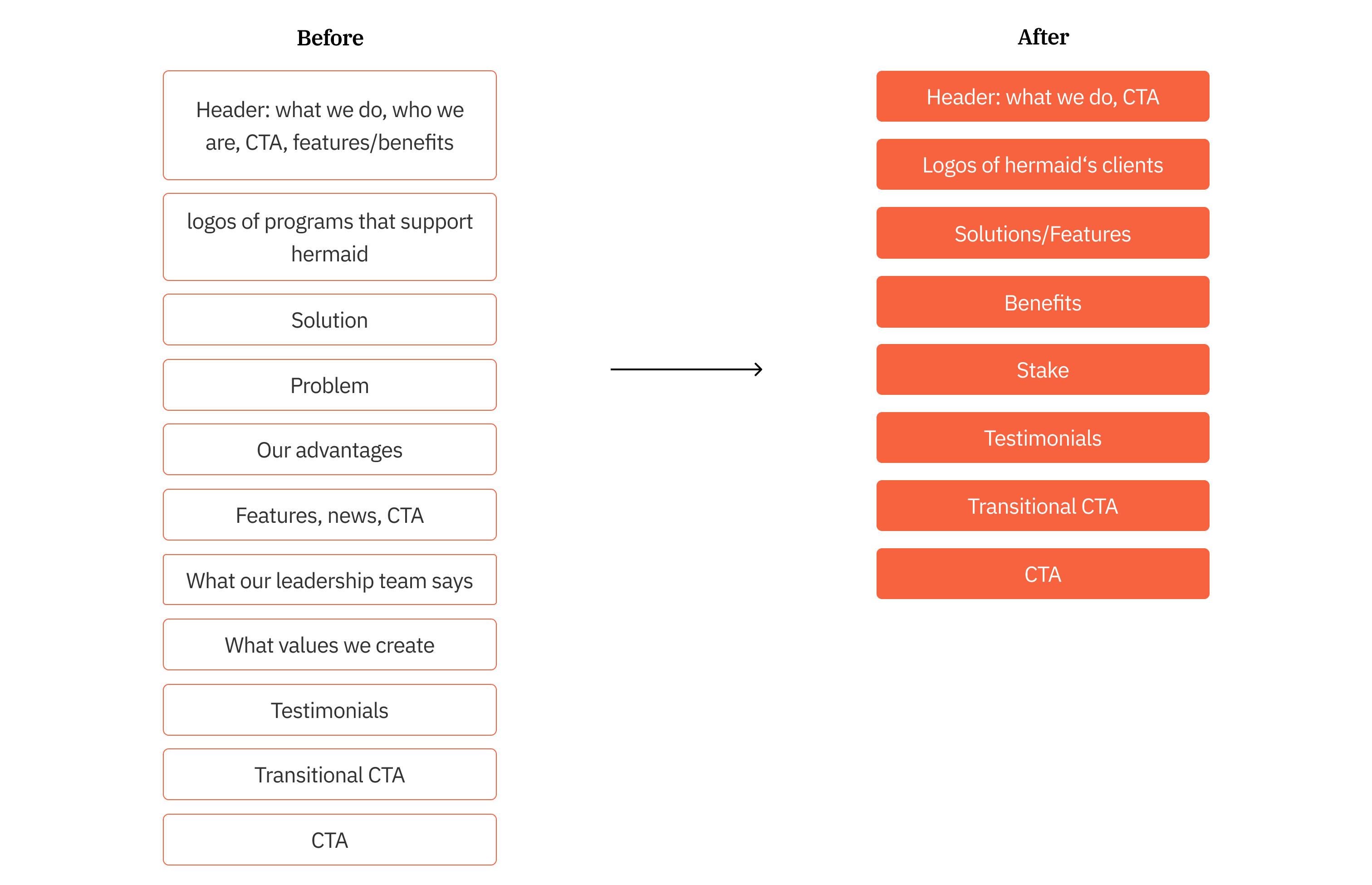
#1 Storyline Structure
After analysing the existing structure, I found there are some contents repeat in different sections and the narrative is not intuitive.
After analysing the existing structure, I found there are some contents repeat in different sections and the narrative is not intuitive.

#2 Engaging Interaction
Apart from free resources, add a cost calculator could intrige the user and improve the user engagement.
Apart from free resources, add a cost calculator could intrige the user and improve the user engagement.

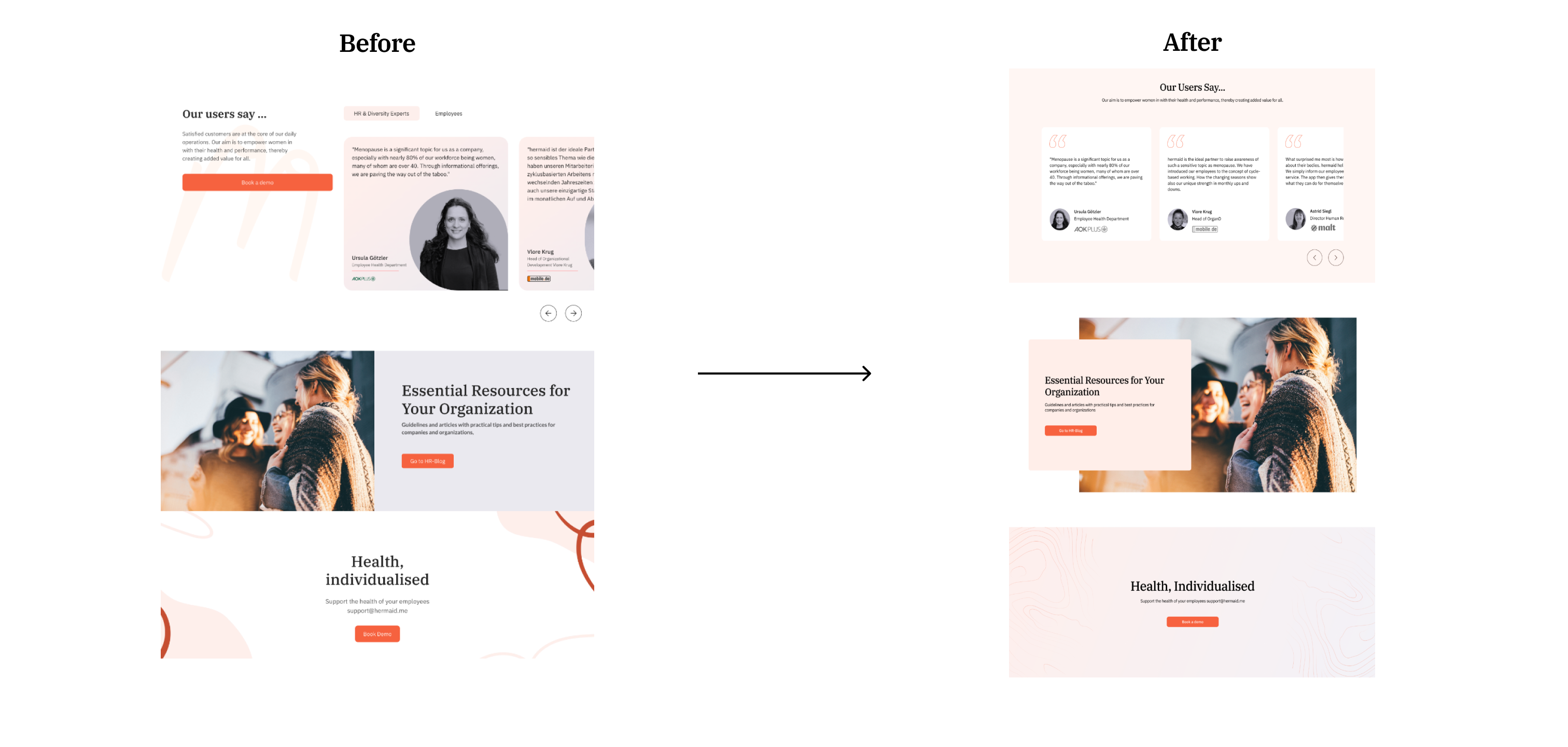
#3 Consistent Visual Design
While removing some sections out of the structure, ensuring the colors and graphics are on-brand and optimizing heirarchy.
While removing some sections out of the structure, ensuring the colors and graphics are on-brand and optimizing heirarchy.

Final Solution
Before
After


User Feedback
I measured the time people need to understand the service and the readability with 10 participants.
Takeaways
Brand storytellingWhether it's the experience or the content, the audience should be the hero, not the brand. Thinking the audience-first, helps reduce the distractive content and tends to have a convincing story.
Be agile Collaborated with cross-functional team members, I honed my skills in conducting the reseach and delivering the design in 2 weeks. Due to some constriants, only the “Stake” section was launched.
Data InsightsIf I have more time, I will set up the website with Google analysis to have data-driven insights and hopefully to see the improvement on engagement. Also, continue to gather feedback and make improvement.